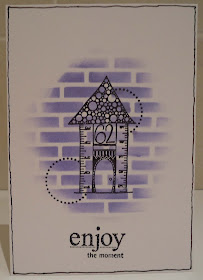
You see.....my usual technique, when I make a mistake (which I usually do) is to slap another layer over it. But in this challenge, I couldn't do that, so each time I made a mistake I got out another card blank and started again. I soon realised I was going to run out of blanks and started cutting the backs off and using them. So this card is a card that could be a one-layer-card in the hands of someone more efficient.
I sponged lilac Brilliance ink through my favourite Stamposaurus bricks stencil. I stamped the Paper Artsy house, masked it and stamped the Hero Arts dots circles. The sentiment is from Unity stamps. It did say 'enjoy - savor the moment' but I cut off the 'savor' as it's an American spelling and I'm English and I just couldn't do it! (I'm a teacher!) Finally I hand-drew a border round the card.
 |
| Best supporting act |

Hola Marina, i think your card is a really perfect one layer card :D:D:D:D, the most one layer in the challenge :D:D:D, but is a great design the background is fantastic and your stamps is gorgeous, well done!
ReplyDeleteA hug from Palma
P.S. perfect sopporting for take a photo, all of us have unmentionable little secrets behind our photos :D:D:D:D
I think that this is really cool and hats off to you for doing this i have done a simlar thing on sveral occassions..EE
ReplyDeleteBeautiful one layer card piece lol-this could have so been me !! (i am not a confident stamper/colourer and i too had 4 attempts before i could submit my entry this week tee hee!!)This is a beautiful piece of stamping :) xx
ReplyDeleteIt is beautiful and I love the story behind it :)
ReplyDeleteBest wishes Chrissie xx
This whole tale made me chuckle! I love the card aswell!
ReplyDeleteSharon
I think this is a brilliant piece of masking and sponging Marina and I love that you came clean about your technique! Your photo caption had me giggling too! Oh and I'm not a teacher but I can't do it either. Vicky x
ReplyDeleteI know how you feel about spellings... my daughters go to American style schooling and it took me like 8 years to forgive the American way of spelling... lol. My older one - all of 13 not yet explained to me that the American way of spelling is rational and logical. I had no choice but to accept it. Lol.
ReplyDeleteYour card is fantastic... love the masking and the house is so cute. Perfect sentiment too.
Monicaxxx
Hee he had to laugh at the confession because I too have done this in the past and after posting pop it on to another card but I'm not as honest as you!! Brilliant card by the way love the image ! x
ReplyDeleteSounds like a cunning plan to me! Fabbylicious card/front too!
ReplyDeleteKathyk
You are not on your own re running out of blanks when trying to create a one layer card! This is just super and your blog so made me smile. Thanks for cheering up a dismal day.
ReplyDeletelol... i must admit i have used he back of a card before now then after the photo added it as a full page layer to a new card!! you are not alone and i hate waste
ReplyDeleteThanks so much for joining us
Jen
Less Is More
I agree with so much here Marina, I don't like to use American spellings on my cards and this sentiment works perfectly in its adapted form. I also hate waste and in its present state it is a one layer card, despite the fact that it has no back!
ReplyDeleteIt is also brilliant!
Thanks so much
Chrissie
"Less is More"
Definitely a one layer card then LOL! I love the effect you achieved and in my fav colour or should that be color!!!
ReplyDeleteLinbyx
Love the card. The stamps are great and work so well together and I really like your colour choice. I like the ingenious way you have propped your card up! Michelle x
ReplyDelete